ProShop
Manufacturing software redesign focused on improving user workflows and operational efficiency
Project Overview
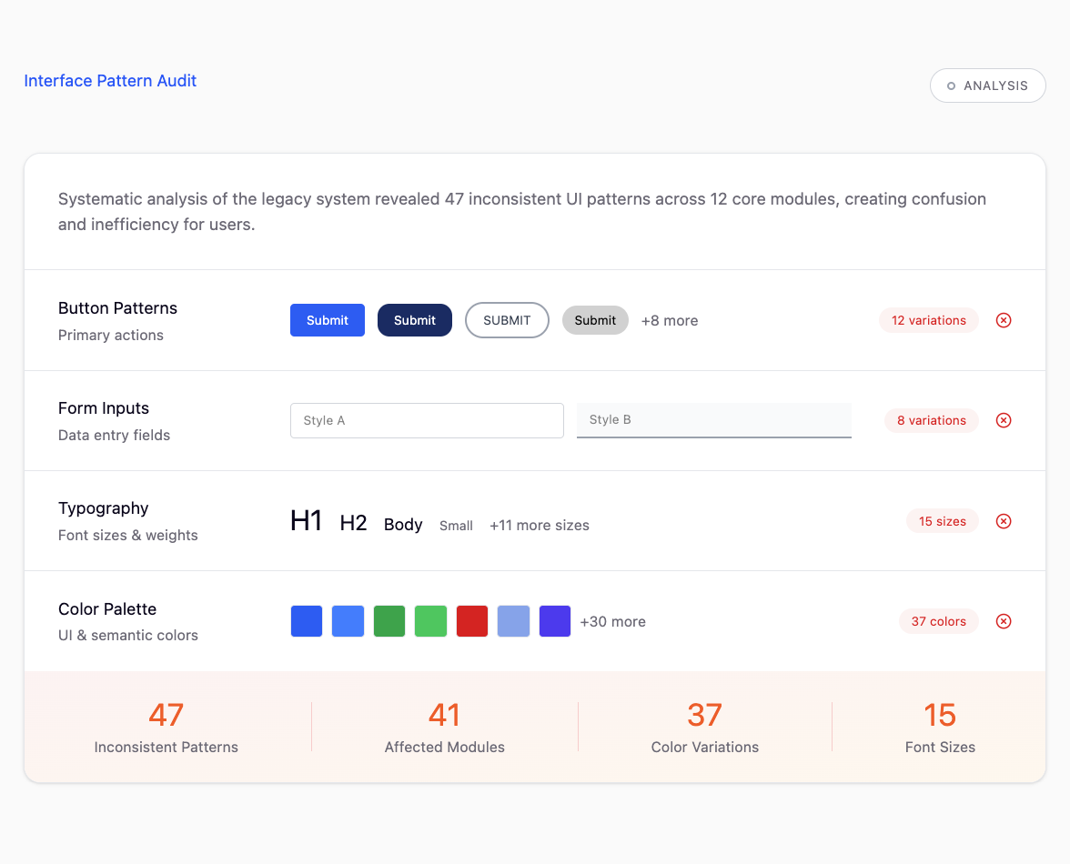
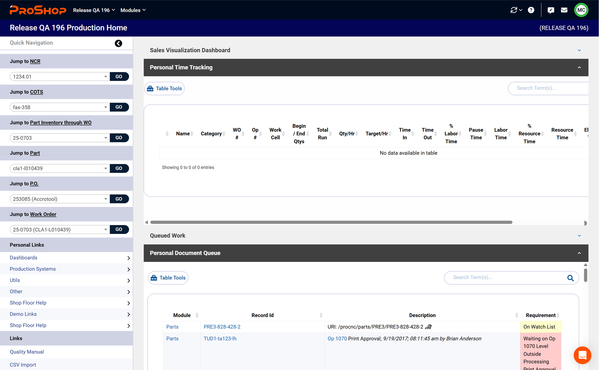
The legacy manufacturing ERP was powerful — but painfully difficult to use. Users were overwhelmed by dense data tables, inconsistent layouts, and long, error-prone data entry processes that slowed operations. Even seasoned staff required one to three months of training before feeling confident.
Meanwhile, the product's outdated interface was costing the company real business. Prospects consistently chose more modern competitors, and client churn was steadily rising.
My mission was simple — reignite trust in the brand by transforming a complex, intimidating tool into a cohesive, intuitive experience that users can confidently navigate on day one.
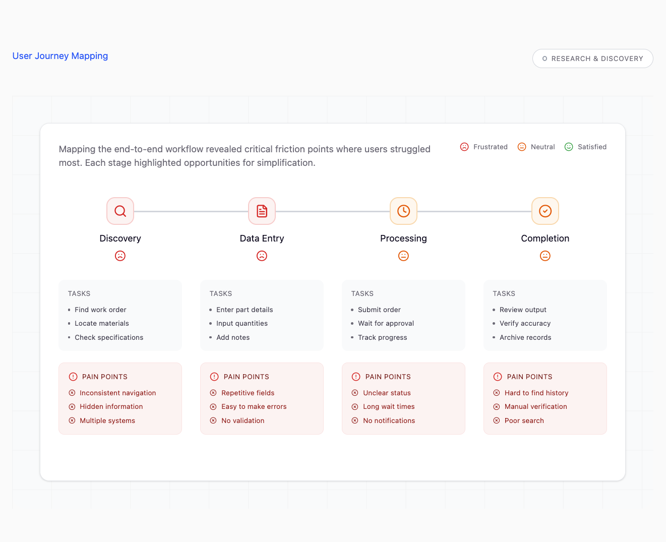
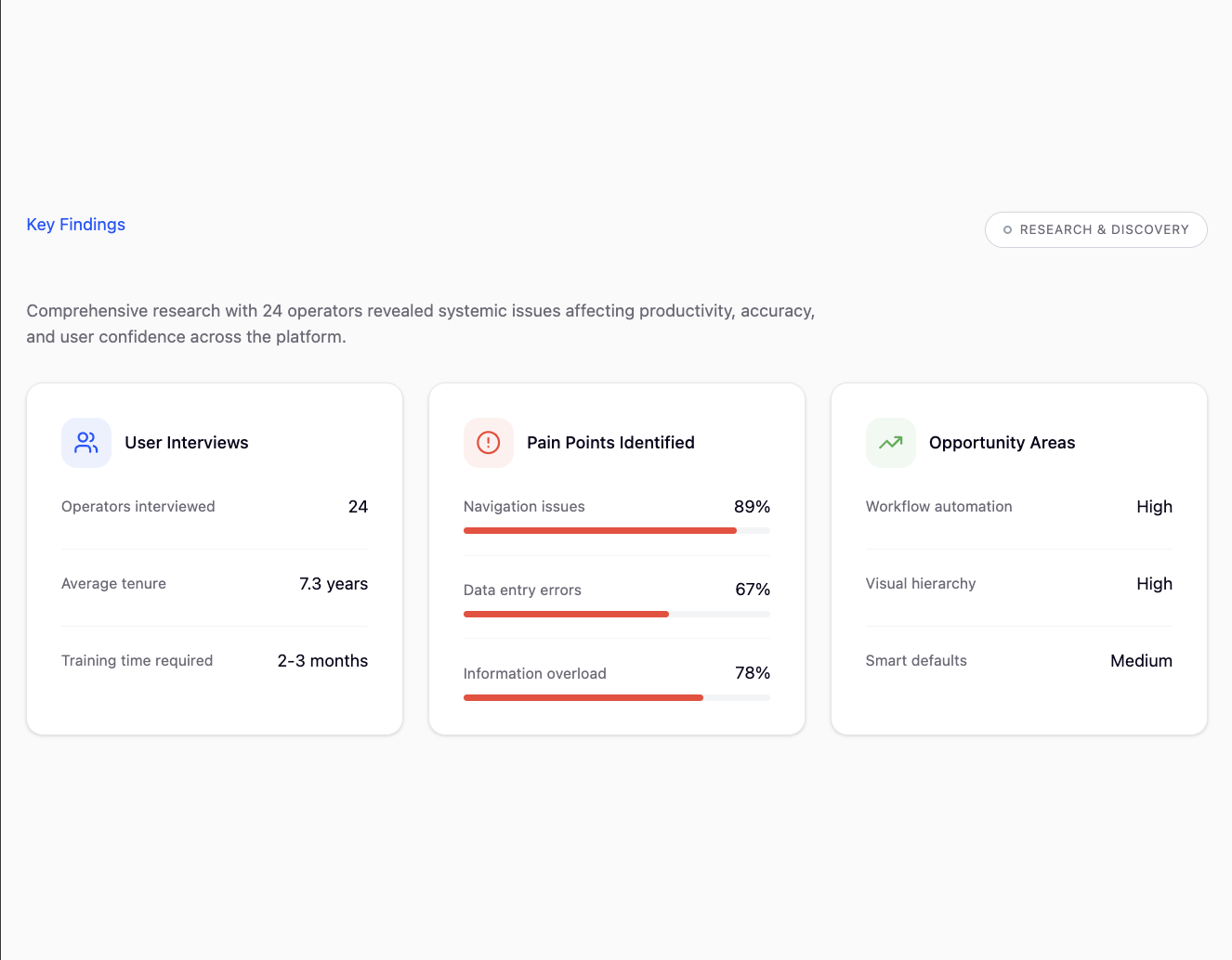
Research & Discovery
I began by conducting comprehensive user interviews with shop floor operators, managers, and administrators. Through shadowing sessions and workflow analysis, I identified key pain points: excessive clicks to complete basic tasks, inconsistent navigation patterns, and a lack of visual hierarchy that made it difficult to find critical information quickly.
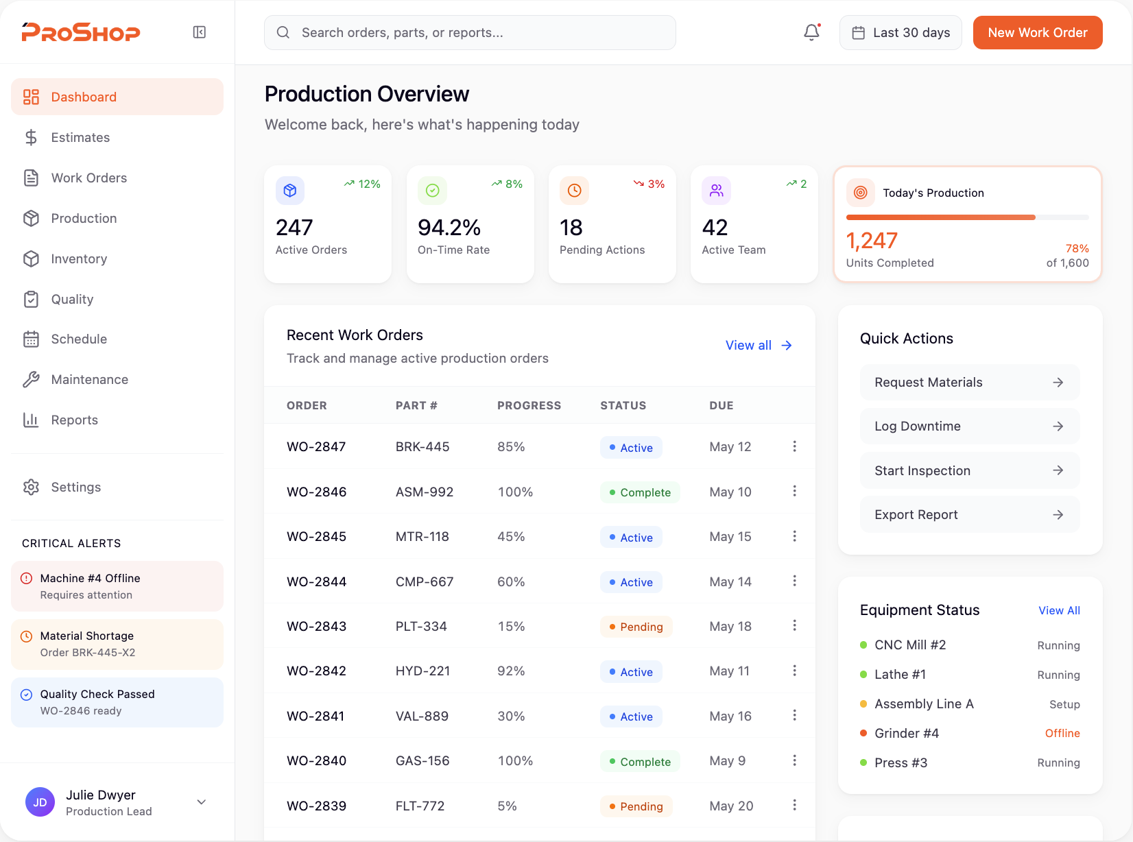
Before & After
The old interface buried users in data overload with no clear visual hierarchy. Critical actions were hidden, navigation was inconsistent, and every screen felt like a wall of text and tables.
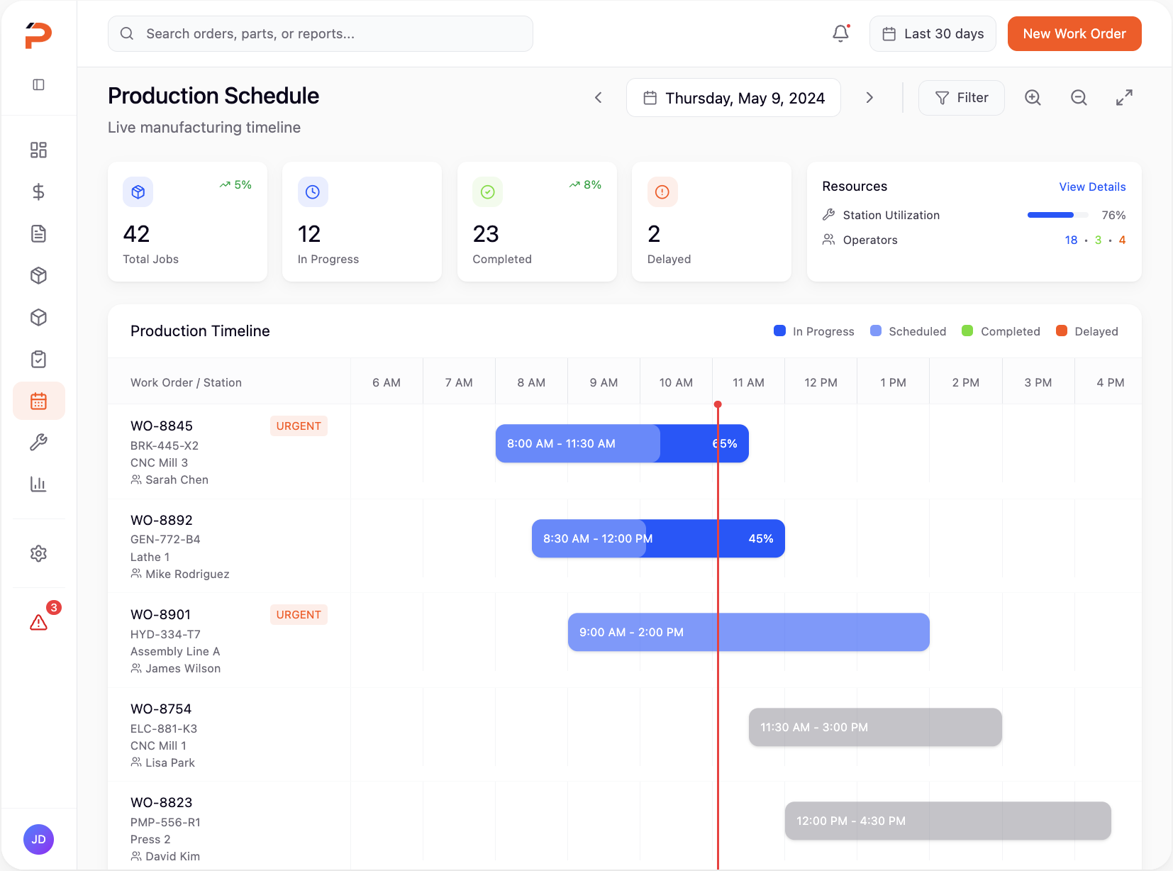
The redesign introduced breathing room, clear visual hierarchy, and intuitive workflows. We reorganized information architecture, implemented a cohesive design system, and streamlined multi-step processes into guided, user-friendly flows.
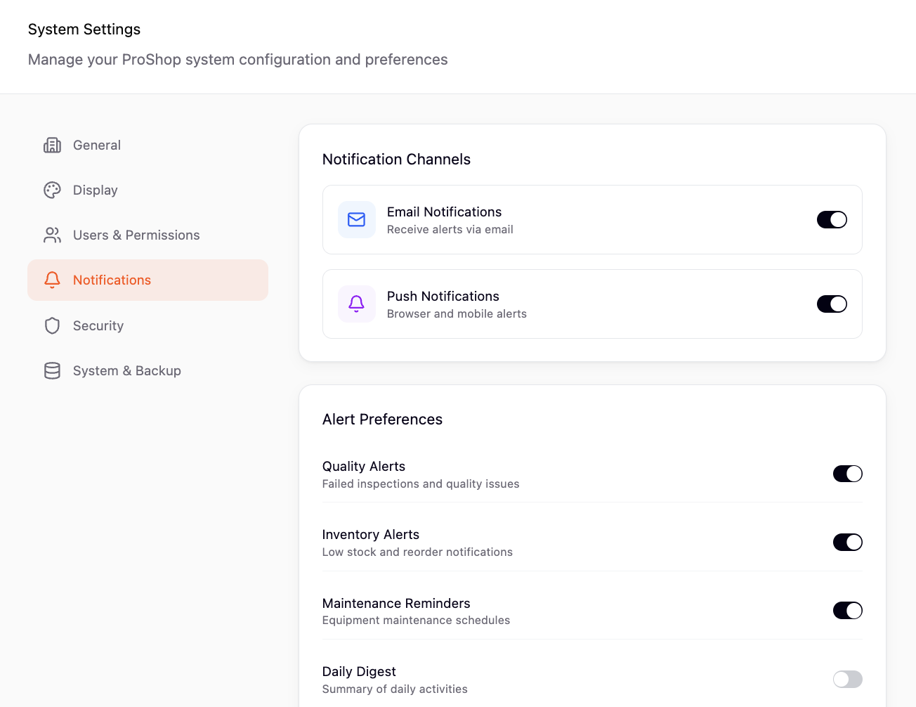
Key Features
A new modular design system brought consistency across all workflows, with reusable components that ensured every screen felt familiar. The new navigation structure reduced cognitive load and made it easy to jump between tasks.
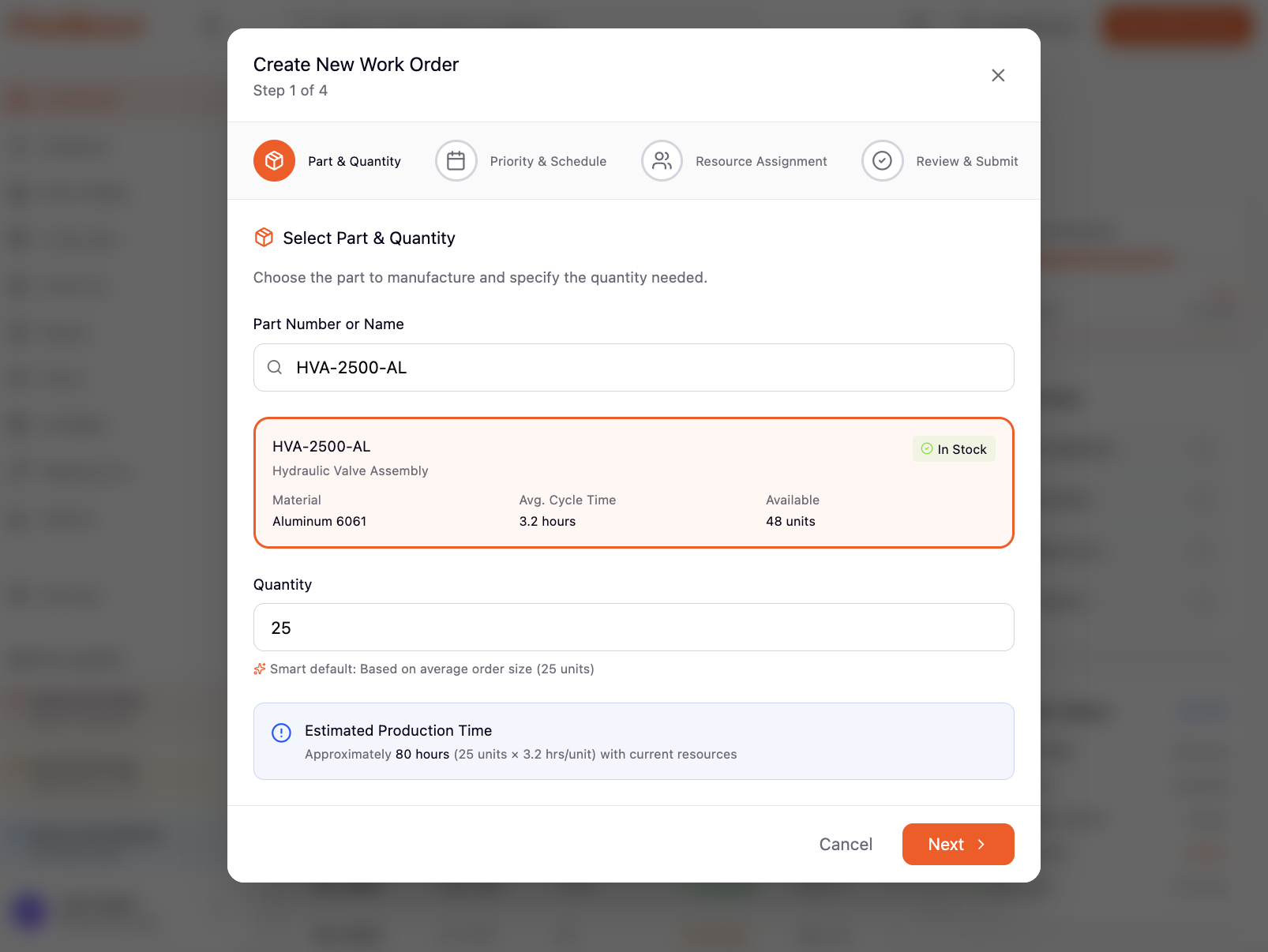
We introduced contextual guidance, smart defaults, and inline validation to catch errors early. Complex forms were broken into digestible steps, and visual cues helped users understand their progress at a glance.
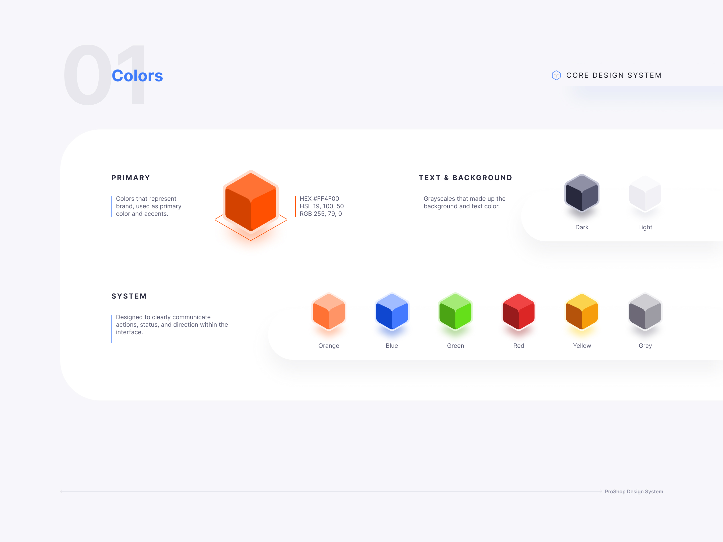
Unified Design System
Consistent components and patterns across all modules
Smart Workflows
Guided multi-step processes with contextual help
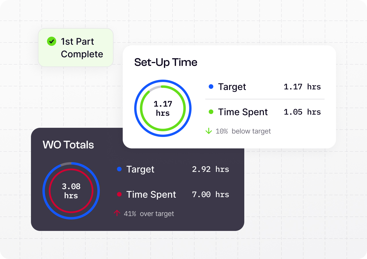
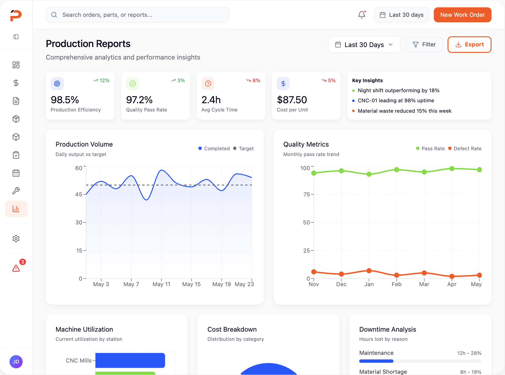
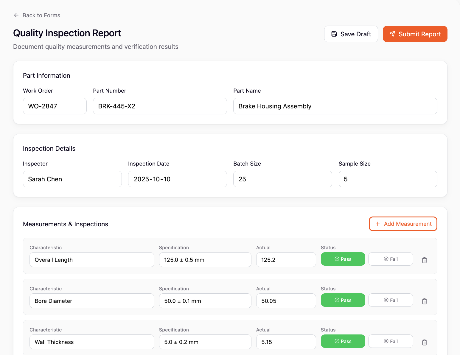
Modern Data Tables
Filterable, sortable, and scannable information displays
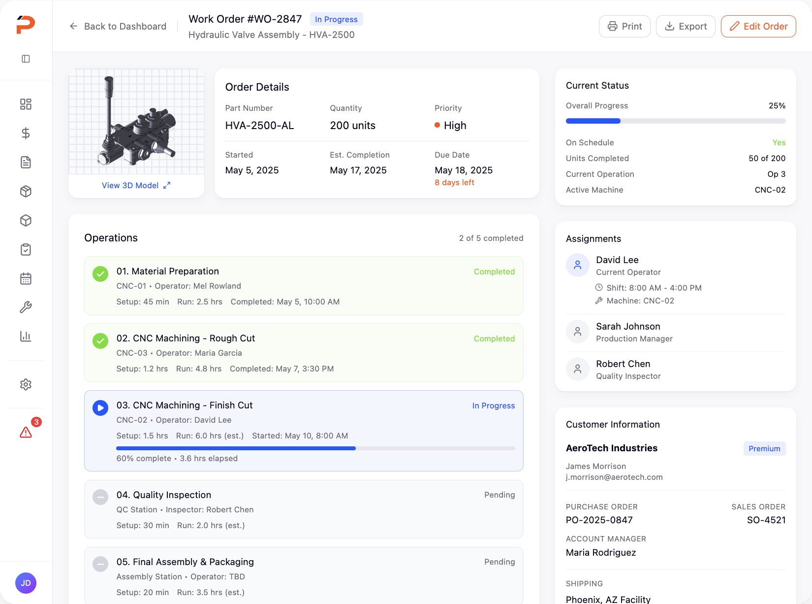
Responsive Dashboard
Real-time metrics and actionable insights at a glance
Key Features
A new modular design system brought consistency across all workflows, with reusable components that ensured every screen felt familiar. The new navigation structure reduced cognitive load and made it easy to jump between tasks.
We introduced contextual guidance, smart defaults, and inline validation to catch errors early. Complex forms were broken into digestible steps, and visual cues helped users understand their progress at a glance.
Unified Design System
Consistent components and patterns across all modules
Smart Workflows
Guided multi-step processes with contextual help
Modern Data Tables
Filterable, sortable, and scannable information displays
Responsive Dashboard
Real-time metrics and actionable insights at a glance
Product Gallery
From the design system library to individual workflow screens, every element was crafted to reduce friction and empower users to work more efficiently.
Impact & Outcomes
The transformation was measurable and immediate. New users could complete core workflows independently on their first day. Client retention improved dramatically, and the modern interface became a competitive advantage in sales presentations.
Decreased onboarding from several months to under 1 day
Improvement in workflow completion and user efficiency
Increase in total annual recurring revenue (ARR)
Key Takeaways
This project reinforced the importance of deeply understanding user workflows before proposing solutions. The most impactful changes weren't always the most visually dramatic—sometimes it was simplifying a five-step process into two, or ensuring consistent button placement across screens.
Working closely with the development team early and often was crucial. By involving engineers in design reviews and prototyping sessions, we avoided technical debt and ensured the final product was both beautiful and performant.